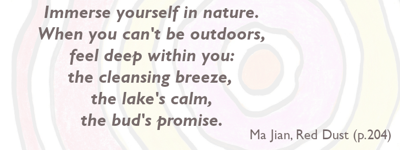
Our is logo inspired by nature (the rings of a tree) in recognition of the fact that human beings are a part of nature and the natural world. The colours reference cultural artifacts that represent diversity and variation that exist in nature, using a colour palette linked to well being. This promotes our belief that mental health and well being (and things which are understood as mental illness) all fall within the natural spectrum of human experience – from love and joy to despair and distress.
We deliberately wished to avoid negative or medically-located images and colours that are associated with mental disorder: that mental health is located in the brain or that mental health is a maze to find the way to the centre of.
The rings of the tree indicate the time that mental well being and health can take to cultivate. Like the rings of a tree, our experiences are a part of us and ingrained in our being. Human beings and our stories are multi-layered, iterated across time and place. Likewise, developing an ethical and balanced approach to the use of digital technologies and solutions takes time and should not be rushed.
The logo, initially developed using digital tools, was completed and refined with hand drawing and colouring. This enfolds together the practice and technological aspects of research; the qualitative and quantitative. It represents that creativity and imagination are vital for mental health and well being, together with thinking about different worlds and ways of living that technology might open up.
The hand drawn aspect emphasises that mental health and well being is always imperfect. Digital technologies and solutions can offer an impression of perfection which hides the stories and humanity of those who use it. It is vital that research captures all these dimensions in its endeavours and outputs.
The logo’s final form and concept was developed iteratively with contributions from our first members.